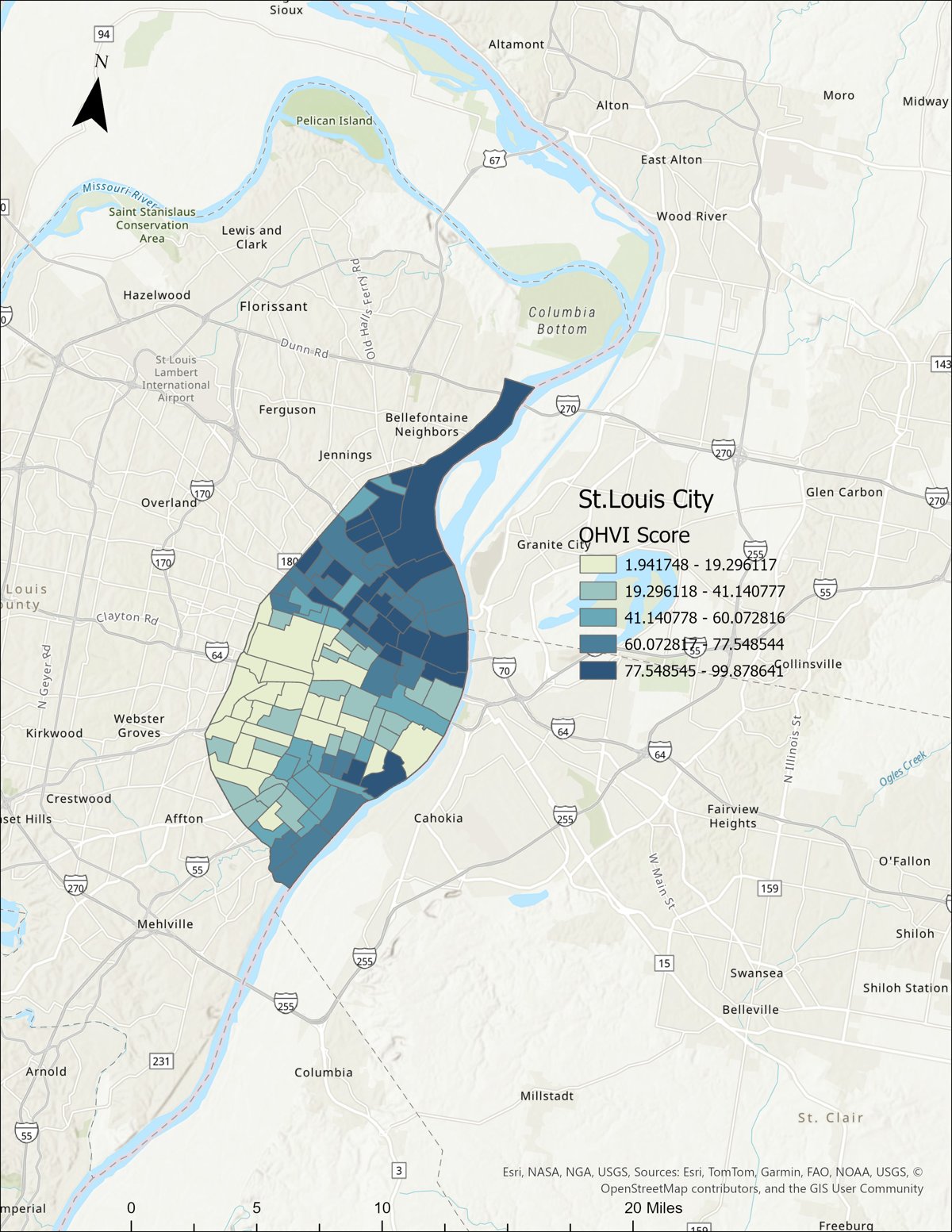
A single score for every census tract, built from eight public health indicators. It shows where tooth loss, chronic disease, and access barriers overlap, and it holds up under formal spatial testing.
Each tract gets ranked on tooth loss, diabetes, smoking, disability, food insecurity, housing insecurity, lack of health insurance, and lack of transportation. The eight ranks are averaged with equal weight, so no indicator is given greater weight than another, and the whole method is easy to check or repeat.
Scores run from pale green (low vulnerability) to dark navy (high vulnerability). The darkest tracts sit in North St. Louis City, running from the riverfront down through the central corridor.
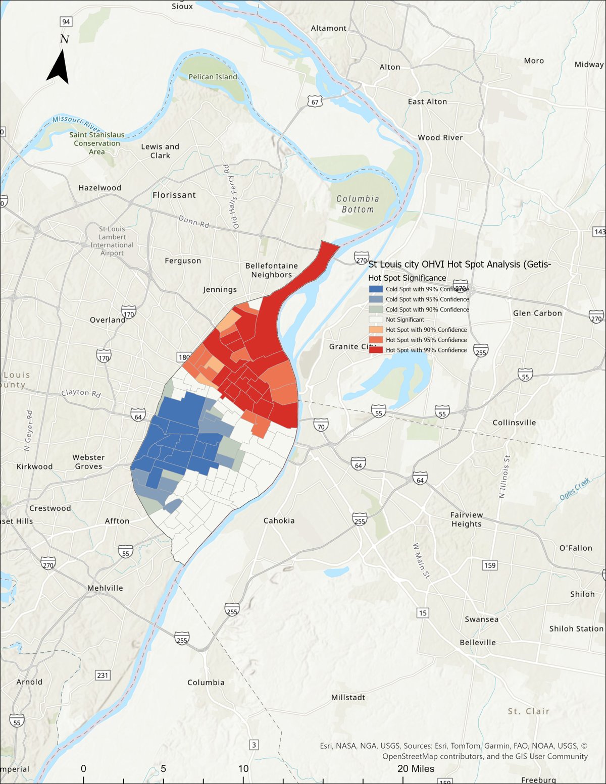
A map can look clustered by coincidence. To rule that out, the scores were run through two formal spatial tests. Both point the same way.
A positive Moran's I means nearby tracts tend to share similar scores. At 0.67, with a z-score of 11.43 and p < 0.001, this pattern is extremely unlikely to be due to chance.
The full index is live as an interactive 3D map, and a companion screener provides ZIP-area OHVI information and dental-care options for uninsured residents and residents using Medicaid.